
Day 39 - The Sun is Hiding
I wanted to finish off the rest of the pages for this design, so today, I created the UI to show te weather for the month.
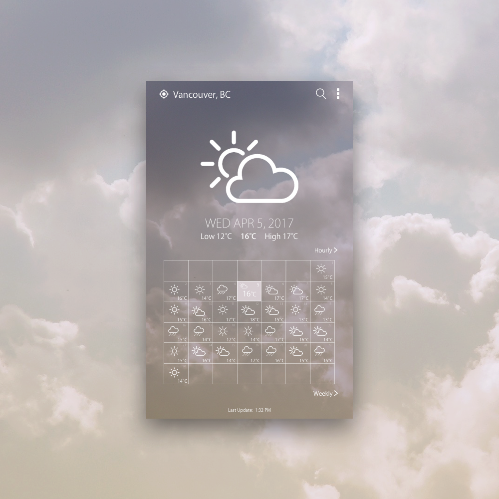
As I was creating this, there were a lot of things that didn't make sense to me. First, what would happen to the calendar if the user is at the end of the month? Would they see the beginning of the next month or would they see the previous 30 or so dates? Next, I didn't know what kind of information I should've added in the little calendar boxes. This really digs into UX and figuring out what users expect to see from a calendar. As for me, I would want to see if its sunny or rainy and the temperature. And that's what I've included in the calendar boxes. Also, I wouldn't say this is the best design for mobile. The boxes are small, therefore they'll be hard to click on. Not only that, it'll be really easy for the user to accidentally click on a box they weren't planning on pressing.
To be honest, I like the layout of the UI, however, from a UX POV, it's not the best. There is much needed to explore before implementing this.